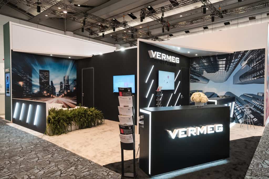
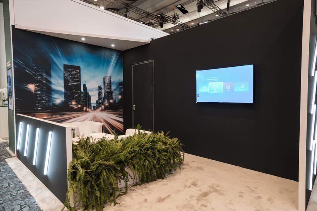
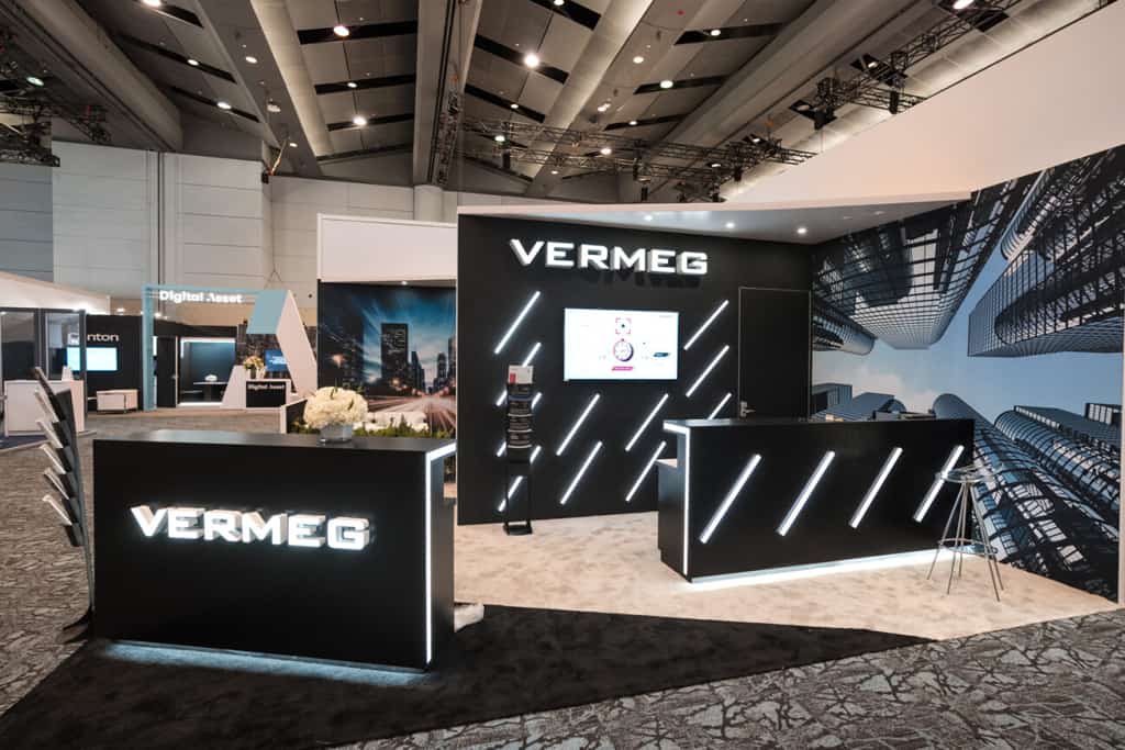
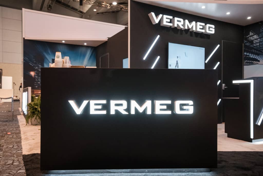
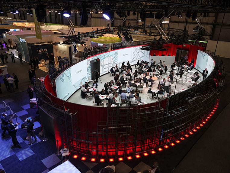
Rapiergroup’s creative approach featured strong architecture and the impactful use of brand messaging via large format graphics, digital surfaces, all complimented with a lighting design to meet Vermeg’s objective of creating high ‘visibility and notoriety’.
Embracing the corporate guidelines and colour pallet of black and white with a touch of red and grey, Rapiergroup ensured their visitors were truly connected to the Vermeg brand.
We truly feel the Sibos stand was original and impactful with a creative touch that highlights Vermeg from the other exhibitors within the hall by its originality.
