The true power of colour and branding that really holds an experience together
The challenge
Branding and wayfinding in any large environment is complex and challenging, but when that environment changes every year, the challenge is enormous. We have created and delivered the Sibos exhibition since 2014. Every year the location and venue changes and at the same time the show evolves and grows year on year. Owning that environment, ensuring that visitors understand what will be their world for the four days of the show and can move around it with ease requires a bespoke logistical and creative approach every time.
Our approach
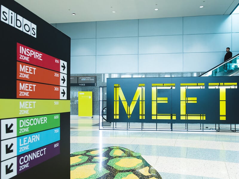
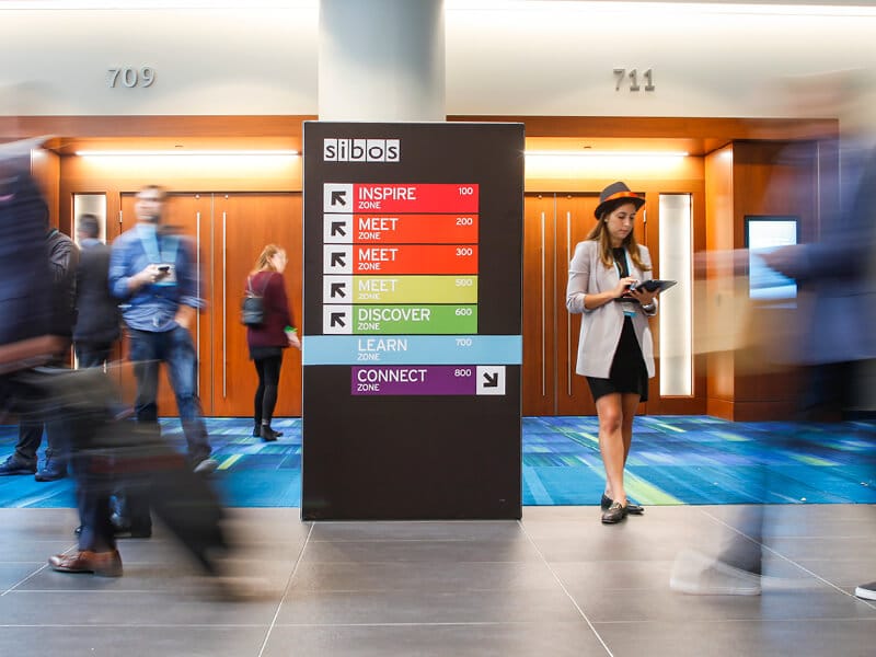
We’ve always felt that branding and signage works best, and is most powerful, when it’s kept simple. We’ve learnt from previous years that trying to communicate everything at each point does not work. So this year, we proposed a brand new approach that involved the creation of distinct zones and the use of colour to support the identity of each one. We also helped drive the pre-communication strategy that established the concept of zones well before any visitor arrived at the actual venue.
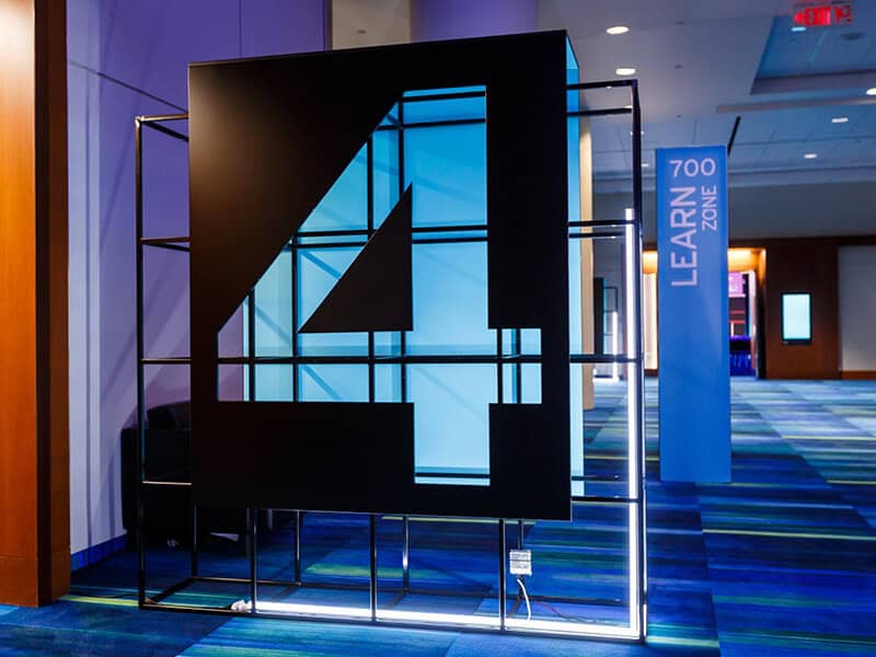
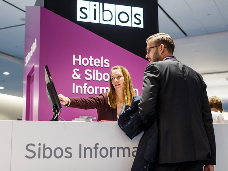
The venue itself is very large and disjointed, spanning across two main towers over multiple levels with long walkways in between. Logistically, it was our biggest challenge to date. The creation of zones allowed for grouping of essential touchpoints, so we could drive traffic to the zone, rather than the touchpoint. Sibos is a very colourful brand, so we were able to draw from the pallet of secondary colours and give each zone it’s own visual identity. It is impossible to just think of signage when taking this approach, for this to have real power you have to think of everything. We introduced black as the device that was present throughout all elements of Sibos and combined it with the zone colour for all touchpoints within that area. This language ran across all printed, digital and architectural elements. To help establish the zone identities further, we created physical idents that greeted visitors as they entered a new zone. All venue overview maps and high level directional signage utilised the zone identities and colours, ensuring complete continuity throughout the show.
The result
The result was a show that not just worked, but worked better than ever before. Even though this was a new concept, it felt like it was always meant to be there. People didn’t get lost. The feedback is overwhelmingly positive and we are sure that it is down to thinking big picture. Not just in terms of applying this logic throughout the whole event, but giving it life through communication pre-event and all digital channels.
It has been decided that the concept of zoning and the use of colour as well as applying the logic and identity across every single touch-point will now be used for future Sibos shows. We have created something that has real life, so we plan to let it have a good one!
