THE CHALLENGE
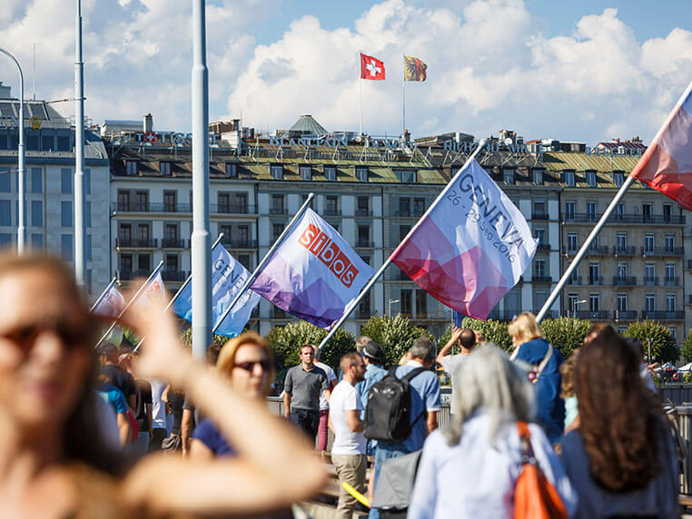
Since 2014 Rapiergroup has designed and delivered the experience that is the Sibos exhibition every year, on behalf of Swift. Sibos is the world’s premier financial services event. For Toronto 2017, we were extremely proud to be involved in the creation of the story, theme and design language across the whole event. Knowing the story inside out put us in a great position to be able to propose our most experiential concepts ever within the most challenging venue to date.
OUR APPROACH
The Metro Toronto Convention Centre (MTCC) in Toronto, home to Sibos 2017, is a great location, but comes with big logistical and creative challenges. We approached the task with the intention of telling an engaging story, immersing delegates within an experience, challenging them and leaving them thinking and ultimately talking about what is really important.
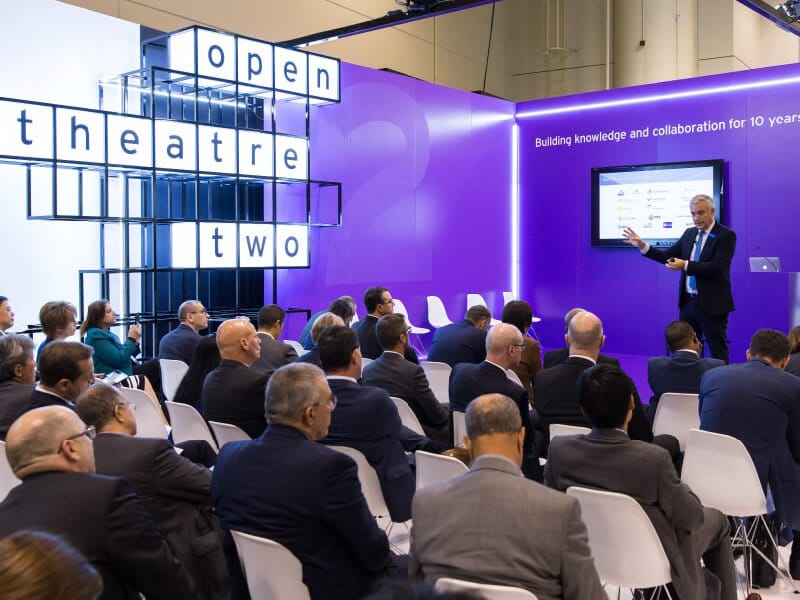
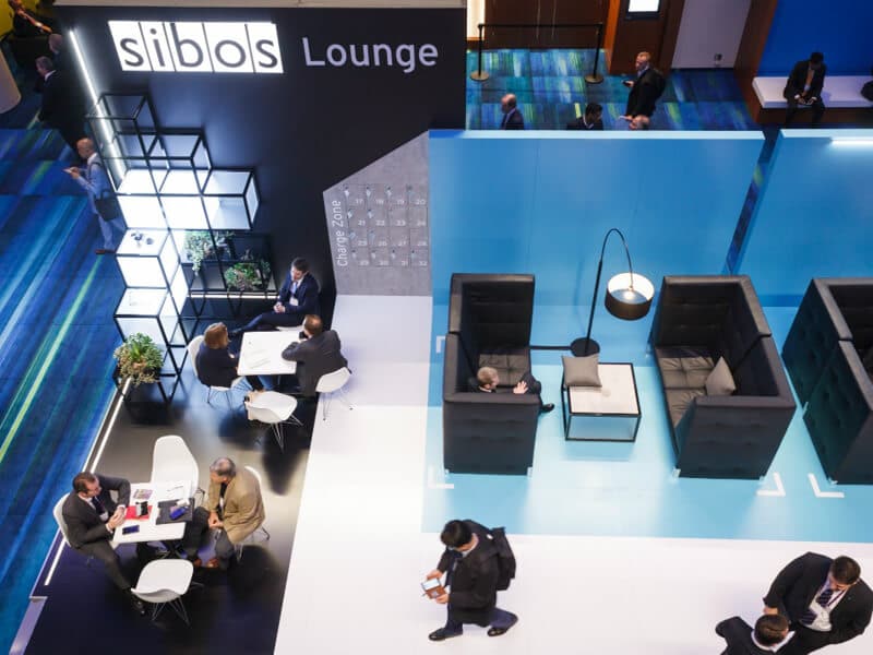
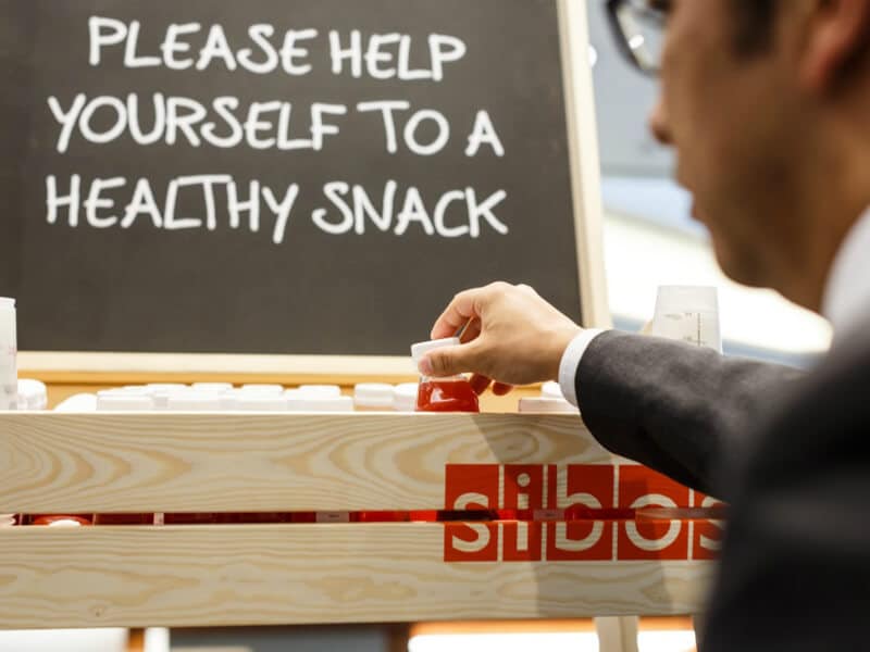
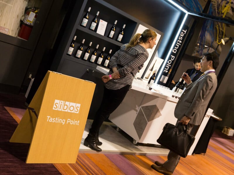
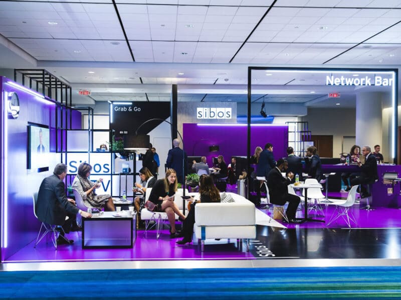
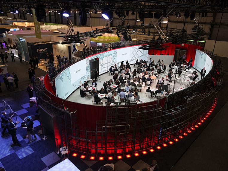
A smaller exhibition hall than in previous years, with space prioritised for exhibitor stands meant we looked at innovative uses of pre-function spaces to create the all important infrastructure elements. These vital touch-points are the life blood of the show and essential for delivering the right support and experience to visitors. The venue itself spans across two main towers, with long walkways between each. We saw these areas as opportunities for further engagement with visitors and created experiential points, making the dots between key touch-points much shorter. In contrast to the main business of the event, these were an opportunity to offer visitors respite and refreshment, enjoy tastes of the local area, understand some of the needs of the city and see how Swift, Sibos and visitors themselves were giving something back through CSR activities. Wrapping this up within one powerful and cohesive design language created a strong thread throughout the whole event, underpinning the main theme of ‘building for the future.’
THE RESULT
Our client felt that this was the most cohesive Sibos ever, the visual effect of not just Rapiergroup’s but all partners work, harmonising as one. It meant that all elements of the Sibos world joined up seamlessly, resulting in an experience that was the most effortless for visitors to date. The feedback speaks for itself and we are incredibly proud of it. Some of our new ideas were so well received that they are now becoming permanent DNA elements to the Sibos experience moving forward. Attendance figures were higher than any Sibos we have been involved in and despite venturing into new territory in some areas, it all worked seamlessly and felt natural. This is the power of design, when it just works and people don’t need to think about why.
